Visualizing a World of COVID-19 Uncertainty
A picture is worth a thousand words, or so the saying goes. But it’s what a picture fails to say that can make it dangerous, especially in times of uncertainty. This week, the Northwestern Buffett Institute for Global Affairs welcomed Northwestern computer science and journalism professor, Dr. Jessica Hullman, and University of Michigan information professor, Dr. Matthew Kay, for a discussion about popular visualizations of COVID-19 circulating through the mainstream media and how they can be misinterpreted. Here are five key takeaways from the discussion:
“COVID-19 case data is biased.” A lack of widespread testing in the United States and elsewhere produces “extreme selection bias,” Hullman said. Countries such as Iceland and small swaths of the U.S. like Telluride, Colorado have been able to test very large proportions of their populations and therefore do more random sampling, but the majority of places aren’t doing that, which means “case counts and COVID-19 rates are pretty unreliable.” Hullman noted COVID-19 death rates are more reliable than case rates, but these, too, need to be viewed with caution. Many COVID-19 deaths have been among people with multiple underlying conditions, she noted, so it’s hard to say if the deaths can really be attributed to COVID-19. Hullman suggested looking at growth rates versus case or death rates, pointing to this kind of visualization that plots new confirmed COVID-19 cases against total confirmed cases over time.
“Our eyes are drawn to extremes.” Hullman pointed to visualizations, like maps, that can imply precision where uncertainty exists. Maps can make it difficult for people to make comparisons, she noted. A rural area on a map, for example, could appear to have a very high COVID-19 case rate, but rates for rural areas with very small populations can be unreliable and make COVID-19 rates look more extreme than they actually are. On the flip side, densely populated areas often appear smaller in area, leaving a smaller visual impression and making COVID-19 case rates look less extreme than they really are. Another issue is occlusion—big dots on the map, like the one over New York City on the map below, obstructing views of reality in other areas.
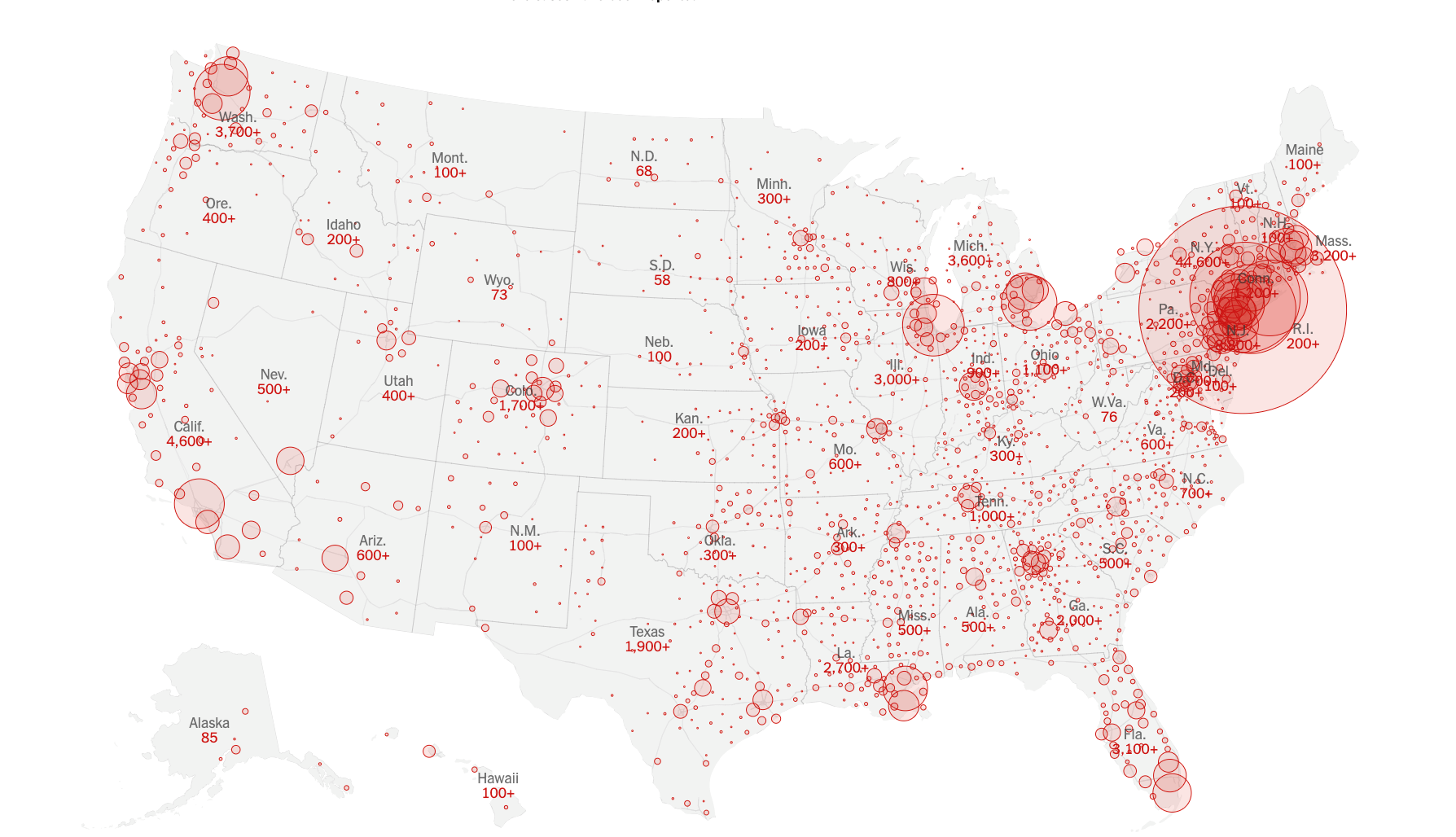
Source: New York Times
“Uncertainty often masquerades as risk.” In communicating risk, we suggest a model designed to predict outcomes is air tight and right. In communicating uncertainty, we’re acknowledging that the models we’ve designed to predict outcomes are approximations of reality, but not perfect representations of it. Some reports, like this one from NPR, break down the assumptions behind model predictions, like those we’ve been hearing of late about the potential COVID-19 death toll. However, many COVID-19 reports and data visualizations make the world look more “fixed” than it really is, Hullman and Kay said. Visualizations illustrating different potential scenarios—what could happen if we stay the course with social distancing versus resume mixing and milling about, for example—are all based on predictive models, “and we have to question the assumptions behind the models,” Hullman said.
Kay pointed to Dr. Alison Hill’s modeling of the spread of COVID-19 as a good example of communicating uncertainty. Dr. Hill’s model comes with a disclaimer: “There are many uncertainties and debates about the details of COVID-19 infection and transmission and there are many limitations to this simple model.” “This is a good example of people thinking really hard and trying to be humble about the applicability of the models they’re running,” Kay said. Another feature of Dr. Hill’s visualizations and others that do a good job of communicating uncertainty, such as this New York Times piece, is their interactivity. People can play with the models’ parameters, Kay said. “Still, understanding how the parameters were chosen is important. People are very good at ignoring uncertainty.”
“Animation helps people experience uncertainty.” Animated data visualizations can do a good job of conveying uncertainty and a range of possible outcomes, Kay said, pointing to this piece from the Guardian illustrating how the measles outbreak spreads and The Washington Post’s “Coronavirus Simulator” as effective uses of animation for visualizing uncertainty. The simulator runs through a couple of different scenarios: one illustrates the implications of social distancing, while another illustrates potential outcomes associated with a forced quarantine, for example. “It requires a little bit of work,” Kay acknowledged. “But if you rerun it a couple of times, you get a sense of the variance and uncertainty in outcomes.”
Kay added that animation can help people contextualize data points. It can also help them sort through hype and sensationalism, he said, pointing to this animated data narrative on gun deaths in America, which shows how mainstream media headlines can cloud perceptions and skew reality.
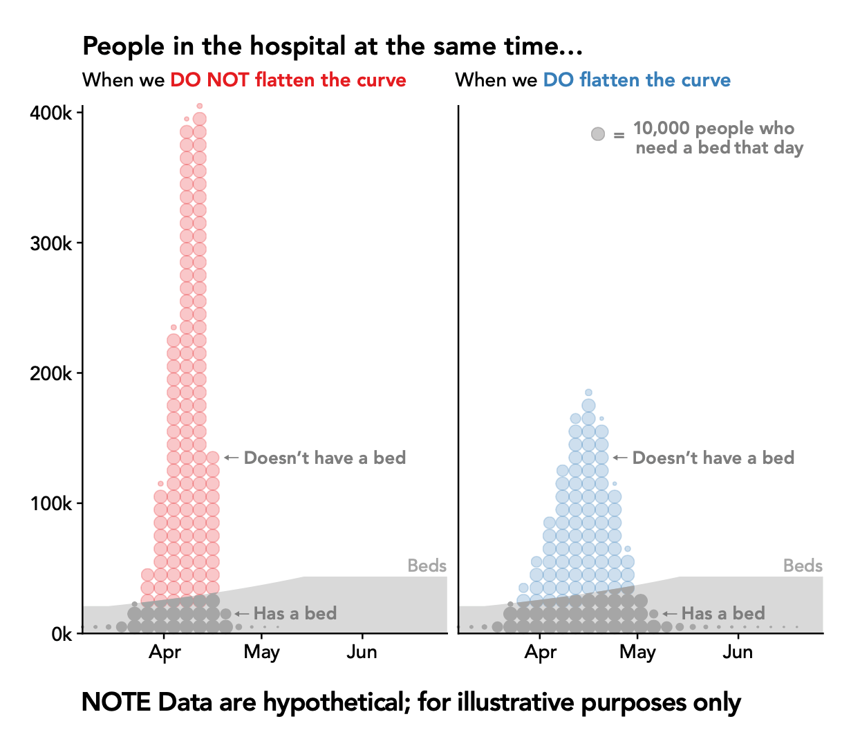
Abstraction can be effective—to a point. “Flatten the curve” as a rhetorical device has been a really powerful idea, Kay said. It’s a pithy and sticky call to action, but abstract visualizations of the curve lack humanity. They can obfuscate the fact that these are people we’re talking about, Kay noted and suggested dot plots like the one below as an alternative. With each dot representing 10,000 people who need a bed on a given day when we do or don’t flatten the curve, this type of visual can “help you really reason about the fact that this is happening to real people,” he said.
Ultimately, visualizations can be dangerous if taken at face value, Hullman and Kay warned. Graphs are often seen as “the epitome of science,” but a single visualization will never tell the entire story. “If we’re not straightforward about uncertainty—in this case, the fact that models may over or underestimate the severity of COVID-19—people may not trust science in the future. All we can do is be very clear about our assumptions,” Hullman said.
Additional resources on techniques and best practices for visualizing uncertainty:
Amanda Makulec. Ten Considerations Before You Create Another Chart About COVID-19
Amanda Makulec. The Unpredictable Curve of COVID-19
Tobias van Schneider. A Data Designer’s Responsibility During a Global Crisis.
Multiple Views: Visualization Research Explained
The Midwest Uncertainty Collective
Alberto Cairo’s How Charts Lie